How to Choose the Best Retro Gas Pump Sign?
Choosing the right Retro Gas Pump Sign involves more than finding an attractive vintage image. The sign must suit your space, withstand its environment, and reflect the period you want to recreate. A bright diner may need bold red enamel and cream lettering. A quiet garage display might look better with faded paint, worn edges, and a modest glow.
Michael R. Hayes, a vintage signage restoration consultant, offers a useful guideline: “A convincing sign should look lived-in, not carelessly damaged.” That distinction matters. Artificial rust can appear flat and repetitive. Hand-finished distressing usually creates more believable texture, especially around screw holes, corners, and raised lettering. Inspect those details closely.
Material choice affects the final impression. Powder-coated steel feels durable and clean, while aluminum offers lighter installation. Glass neon can create genuine period atmosphere, but LED lighting often provides safer, simpler maintenance. Neither option is automatically best. Your wall, power access, viewing distance, and budget should decide.
Check the sign’s dimensions before ordering. A narrow model can disappear above a workbench. An oversized sign may dominate a small room. Measure the wall, mark the outline with painter’s tape, and view it from several steps away. It sounds excessive. It prevents regret.
Color accuracy also deserves attention. Screen images can mislead you. Ask for finish photographs in natural light, especially when buying a distressed Retro Gas Pump Sign. Some imperfections add character. Others simply suggest poor manufacturing. The difference is easy to miss online, and I have learned that attractive photographs do not always reveal thin metal, weak mounting holes, or uneven lettering.
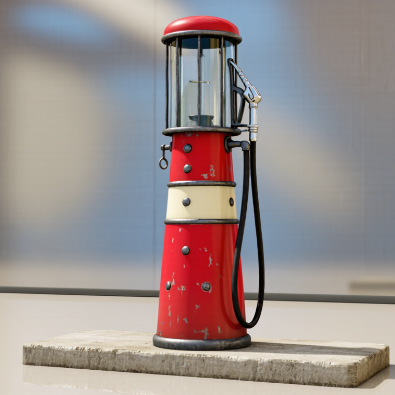
Define the Style and Historical Era of the Retro Gas Pump Sign
Choosing the best retro gas pump sign starts with its historical era, not its color. A 1930s sign often used rounded metal panels, hand-painted lettering, and early neon tubes. Postwar signs became brighter, taller, and more optimistic. By the 1960s and 1970s, molded plastic, bold stripes, and illuminated boxes were common. Match the sign to your building’s architecture, pump design, and surrounding materials.
Industry data can guide scale. The U.S. Energy Information Administration reported roughly 145,000 retail gasoline stations nationwide in recent years. That wide network reflects decades of changing sign standards and roadside design. NACS research also shows that fuel retailing remains highly visual, with convenience stores selling most motor fuel in the United States. Therefore, proportion matters. A narrow sign may suit a small garage. A tall pylon sign needs open space and strong nighttime visibility.
Tips Study archived photographs from your region before ordering. Check the letter spacing, mounting holes, metal thickness, and light color. Warm white light usually feels older than sharp blue light. Avoid mixing 1950s lettering with 1970s graphics. A perfect replica can feel wrong. I have found that small scratches and uneven paint sometimes create more character, but excessive aging can look artificial. Review the Sign Research Foundation’s guidance on legibility, then inspect the sign from the road, not only from a close distance. One detail is often missed: historical accuracy should still allow safe, readable installation.
Compare Materials, Sizes, Colors, and Reproduction Techniques
Choosing the best retro gas pump sign starts with its material. In my workshop experience, powder-coated steel gives a heavier, more authentic feel. It also handles outdoor exposure well when sealed properly. Aluminum is lighter and resists rust, making it practical for garages or covered patios. Porcelain enamel looks exceptionally convincing, but it usually costs more and may chip if handled roughly. Thin plastic can reduce costs, though it often feels less substantial.
Size should match the display surface, not just the available budget. A small sign can disappear above a wide workbench. A large sign may overwhelm a narrow wall. Measure the viewing distance, then leave enough empty space around the sign. Colors should support the room’s lighting. Cream, faded red, navy, and muted yellow create a period-inspired appearance. Very bright colors can look new instead of nostalgic. Samples matter.
Reproduction technique changes the final character. Screen printing creates crisp, layered color and suits simple artwork. Digital printing allows detailed graphics, but excessive sharpness may reduce the vintage effect. Hand-painted distressing can add believable age when applied carefully. I once chose a heavily weathered finish that looked attractive in photographs but felt artificial in person. That mistake taught me to inspect edges, gloss, and surface texture closely. Slight imperfections help, but random damage does not. Ask for material samples, finish details, and outdoor durability information before ordering.
Evaluate Authenticity, Craftsmanship, and Visual Condition
Choosing the best retro gas pump sign begins with authenticity, not shine. Genuine older signs often show layered wear, softened lettering, uneven color, and small edge chips. Oxidation may appear around mounting holes.
Ask for clear photos of the front, back, edges, and fasteners. Provenance helps, but paperwork is not proof by itself. Compare construction details with dated examples from reputable collector references or museum archives.
Reproductions can look convincing under warm lighting. They often feel too perfect.
Craftsmanship deserves close inspection.
Check whether the metal is evenly cut and whether the lettering is painted, printed, or raised. Raised enamel surfaces should have clean edges, while hand-finished examples may show slight variation. That variation can be honest. Excessive waviness may indicate poor production.
Inspect bends, soldering, mounting holes, and the sign’s overall weight. Weight alone does not prove quality.
For visual condition, separate stable patina from active corrosion. Flaking rust, bubbling, and perforated metal suggest continuing damage. Faded graphics may reduce display value, even when the sign remains attractive.
I once treated patina as automatically desirable. It concealed moisture damage.
Tips:
Use side lighting to reveal dents and ripples. Request a ruler in every photo. Check the reverse side carefully. Measure twice. Record scratches, repairs, and missing hardware before purchasing. A small imperfection may add character, but hidden damage deserves a lower valuation.
Choose the Right Sign for Your Space and Display Purpose
Choosing a retro gas pump sign starts with the space, not the sign itself. A narrow kitchen wall needs a compact design with clear lettering. A large garage can support a wider sign with stronger visual weight. Measure the wall before shopping. Leave room around the sign.
I have tested signs in workshops, cafés, and covered patios. Viewing distance changes everything. Small lettering disappears from across a room. Bright colors may look attractive online but feel harsh under strong lighting. For indoor displays, lightweight metal or treated wood usually makes installation easier. Outdoor areas require weather-resistant finishes, sealed edges, and secure mounting hardware. A sign near a doorway also needs enough clearance for people and moving equipment. Safety matters more than perfect nostalgia.
Think about the display purpose. A decorative sign can use aged edges, muted paint, and a slightly uneven finish. A directional sign should use bold text and strong contrast. Do not mix too many vintage details. The result can look crowded. I once chose a beautifully distressed sign for a dim corner, and its lettering became almost unreadable. That choice was wrong. Check the sign at morning, afternoon, and evening. Artificial light can change its color dramatically. If possible, make a paper outline first. It reveals awkward proportions before drilling holes. A little imperfection can add character, but poor visibility should not be treated as authenticity.
Check Safety, Maintenance Needs, and Overall Value
How to Choose the Best Retro Gas Pump Sign?
A retro gas pump sign should look charming, but safety comes first. Inspect the frame for sharp edges, loose screws, and deep rust. If the sign includes lighting, examine the cable, plug, socket, and insulation carefully. Flickering lights are not a minor detail. Ask for clear electrical specifications and use a qualified technician when repairs are needed. A weather-resistant rating matters for outdoor displays, especially near damp walls or covered patios.
Tips: Check the sign in daylight and after dark. Clean surfaces gently, measure the mounting area, and ask about replacement parts. Take photographs before buying. They help reveal flaws that showroom lighting can hide.
Maintenance affects the real value. Powder-coated metal usually needs less attention than untreated steel, while painted surfaces may fade under strong sunlight. Look for bubbling paint, hidden corrosion, and water marks around the lighting compartment. In my experience, a slightly worn sign can offer better character than a perfect reproduction, but only when its structure remains sound. This is where judgment becomes difficult. A low price may conceal rewiring, repainting, or custom brackets. Compare the purchase cost with delivery, installation, cleaning, and future repairs. Request an invoice, material details, and honest condition photos. A reliable seller should answer specific questions without pressure. Do not assume “vintage style” means durable. Check twice.